Klaviyo App integration
Update Klaviyo contacts with Responsly survey responses to enhance your email marketing campaigns and customer segmentation.
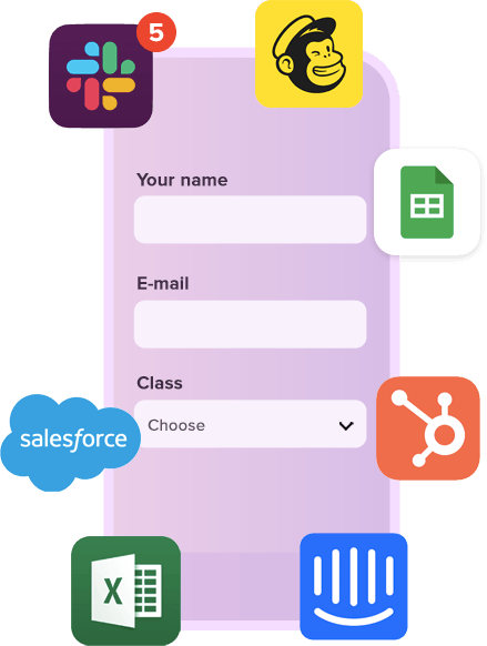
The most popular Responsly integrations: Slack, HubSpot, Salesforce, Zapier, Google Sheets, and Mailchimp — all in one place for fast survey and form setup.
Common questions about connecting Responsly with CRMs, automation tools, spreadsheets, and team apps.
62% of our surveys are opened on mobile devices. Responsly forms are well optimized for phones and tablets.
Responsly get 2x more answers than other popular tools on the market.
Responsly service get an average satisfaction score of 98%
We're complaiant with General Data Protection Regulation (GDPR) that businesses in Europe must comply with when processing personal data.
USA state of California intruduces California Consumer Privacy Act (CCPA) that defines how to handle users' personal data.
All connections are protected by TLS 1.2 and AES with a 256-bit key. Enable 2-Factor Authentication for even better security.
Sign up users with Single Sign-On (SSO) and manage their access to your team. Set permissions and resource access.
You can modify this template in every possible way.
All templates work great on every device.
Use template Open form in a new window